Product judgment · Interaction design · Shipped work
Fix the journey, not just the ticket
Small feature requests often expose a larger broken journey. I find that larger challenge, question weak solutions and work with the team to ship something coherent.
Work delivered with designers, engineers, UX specialists and an external development partner.
The challenge
A narrow request or familiar interaction can hide a larger journey, consistency or usability failure.
My role
I challenged the initial framing, worked with designers and engineers, and kept the larger user journey in view without pretending I designed every screen.
What changed
Login became coherent, the platform areas we controlled became consistent, patient controls became easier to tap and a white-label booking app shipped.
The pattern
01Look past the requested feature
I do not assume the requested feature is the real challenge. I look at the journey around it, find what is actually broken and work with the team to fix the right scope. The examples below are four decisions I helped move from an awkward request or interaction into shipped work.
TPO and PM · Collaborative delivery
02AlphaSense: SSO exposed a bad login flow
The request was to add SSO for one enterprise client. Reasonable enough, until I looked at the existing login flow.
Login was split across an email screen, a password screen and a third screen that decided whether you were in or out. Password recovery and SSO did not belong to one understandable system. I widened the scope and worked with Design and Engineering on a proper redesign of login, recovery and SSO entry.
I did not draw every screen. My contribution was refusing to attach one more branch to a broken journey and getting the larger challenge fixed.
Platform PO · Work inside my team’s scope
03Signant Health: three decades in one platform
CRO teams used TrialMax every day to monitor clinical trials. Different parts looked and behaved as if they came from different decades because, quite literally, they did.
Inside the frontend area owned by my platform team, I pushed for shared components, navigation, styling, interaction behaviour and page structure. The parts we controlled started to feel like one product.
I did not redesign the whole platform, and I am not going to pretend I did. I changed what my team could actually deliver.
PO contribution · UX work and A/B testing
04Signant Health: make the answer easy to tap
Trial patients used locked mobile devices for medication reminders and to record symptoms, pain and other information required by the CRO.
I challenged draggable scales on small touch screens. Asking an older or unwell person to drag a tiny control to an exact value turns a simple question into a motor-skills test.
When the clinical measure allowed it, I argued for three, four or five large buttons. I also took part in A/B testing of patient-facing interfaces.
Product Owner · External partner · Shipped
05Carus: a white-label mobile booking app
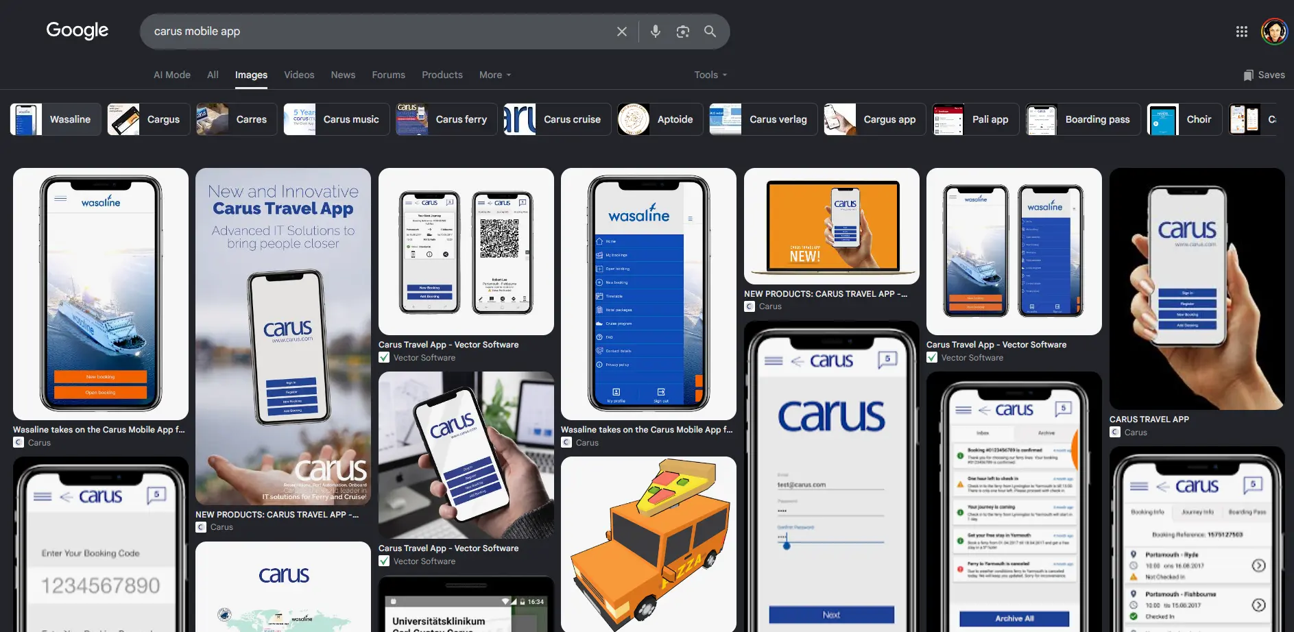
Carus makes reservation software for cruise and ferry operators. The mobile app complemented web booking and had to work across different operator brands.
I guided an external development team, reviewed the design, explained why interactions worked or failed and directed corrections through delivery. The app shipped in more than one operator brand.
The client map shows Carus’s wider customer landscape. It does not mean that every logo used this app.